
FishEye Kombucha
brand identity + packaging design + web design
2020-present
FishEye Kombucha is Nebraska’s first local kombucha brewing company. Based in Fort Calhoun and Omaha, FishEye Kombucha focuses on small batch craft kombucha that brings a fresh perspective on tried and true ancient wisdom to create a high quality delicious and beneficial beverage.
FishEye tasked us with developing a brand identity that would build off the already-existing primary logo. Co-founders Jason Miller and Sara Hinrichs share a love of not only kombucha, but of mysticism and legend. They desired a brand identity for their kombucha company that portrayed such a theme. From there, the legend was born.
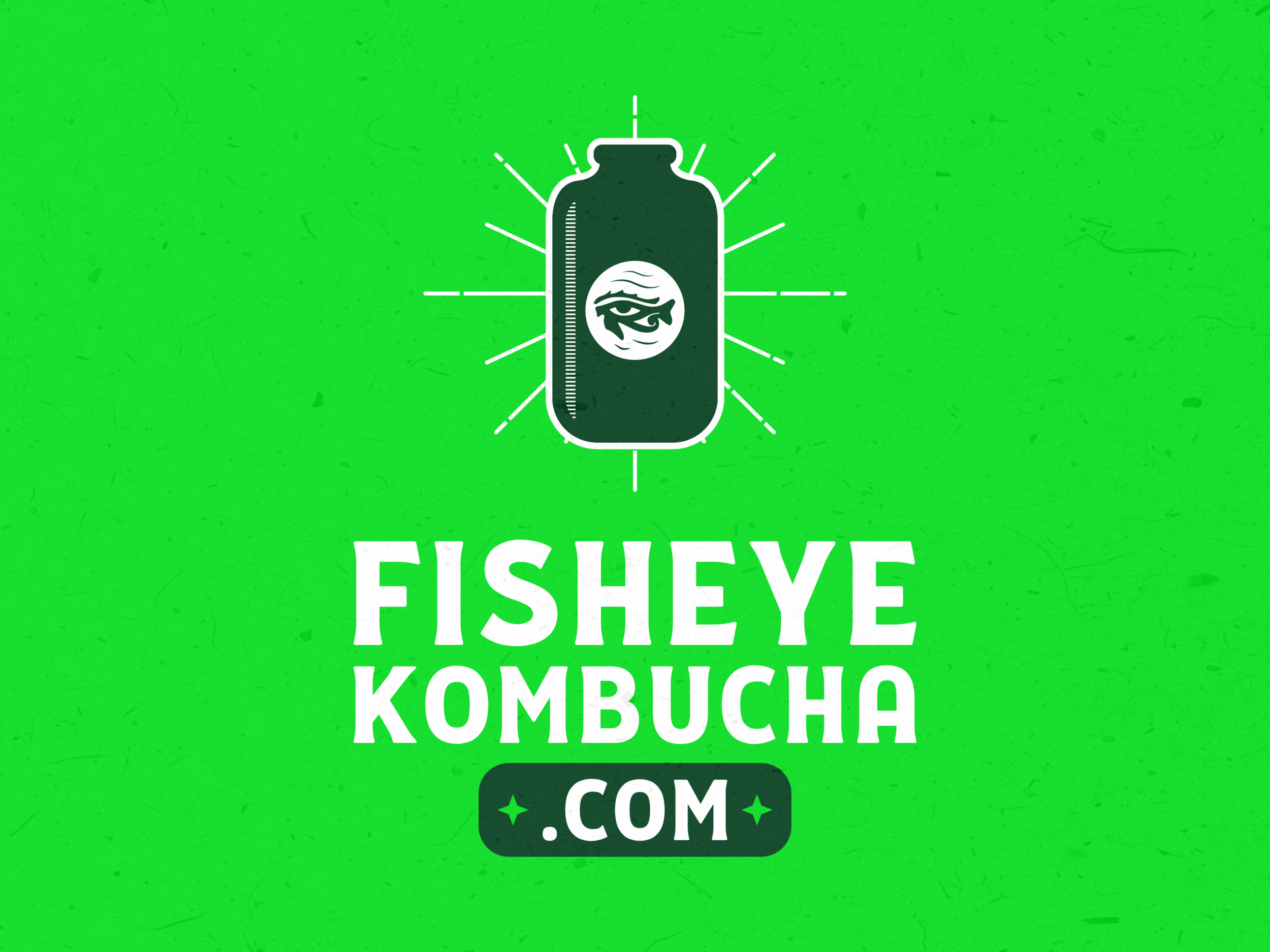
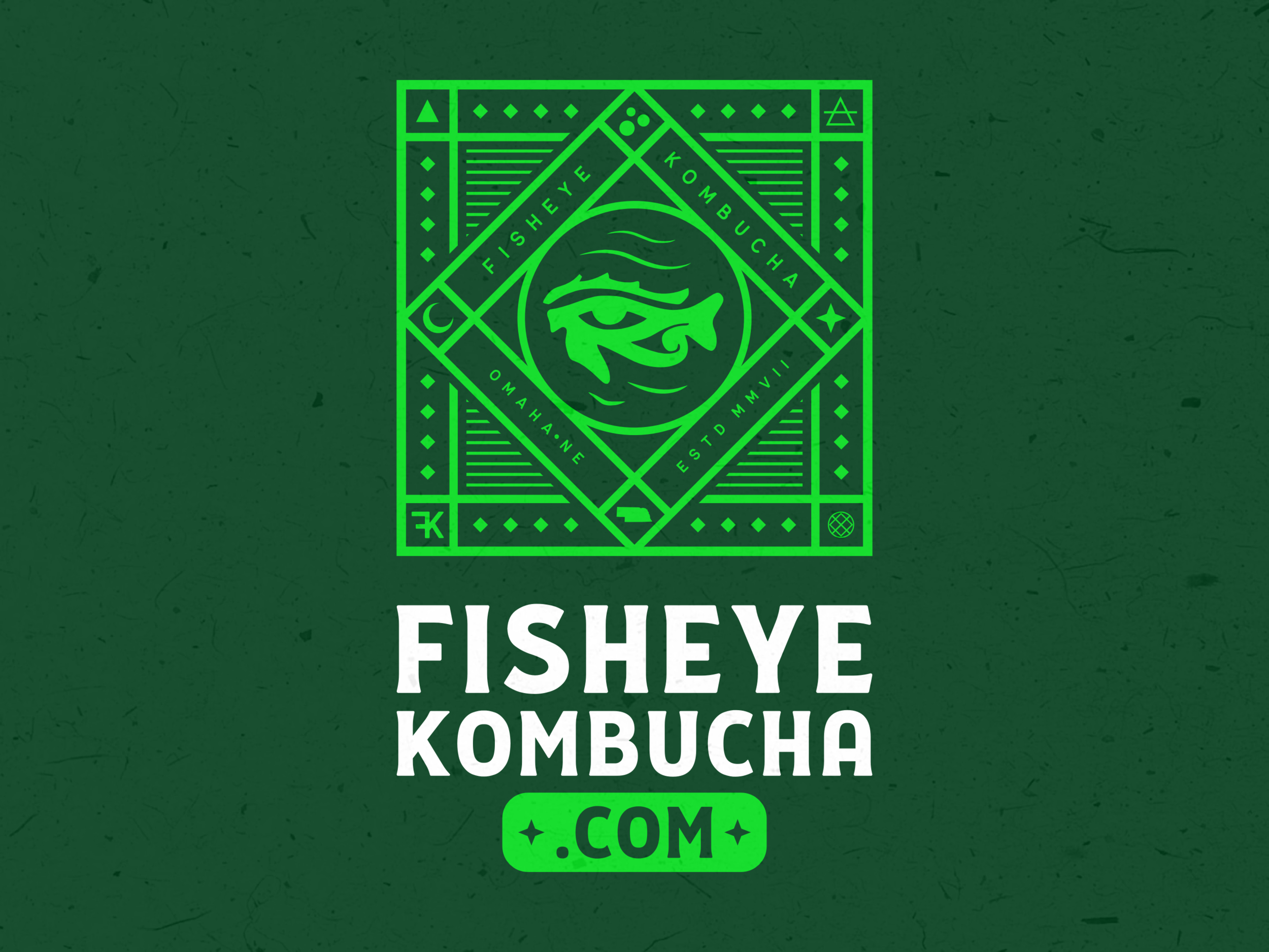
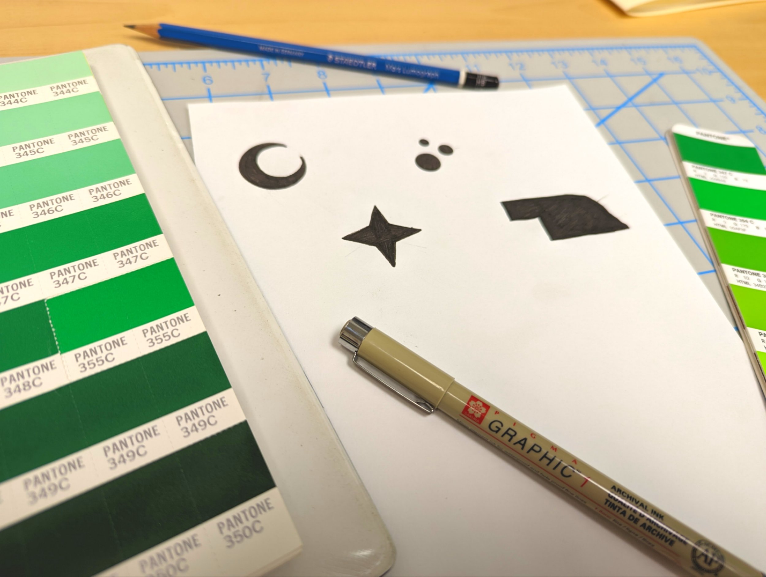
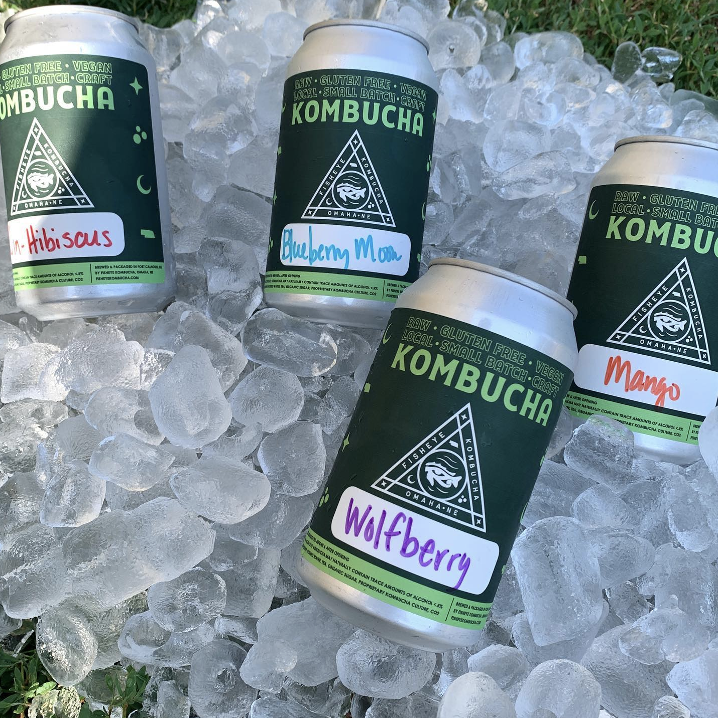
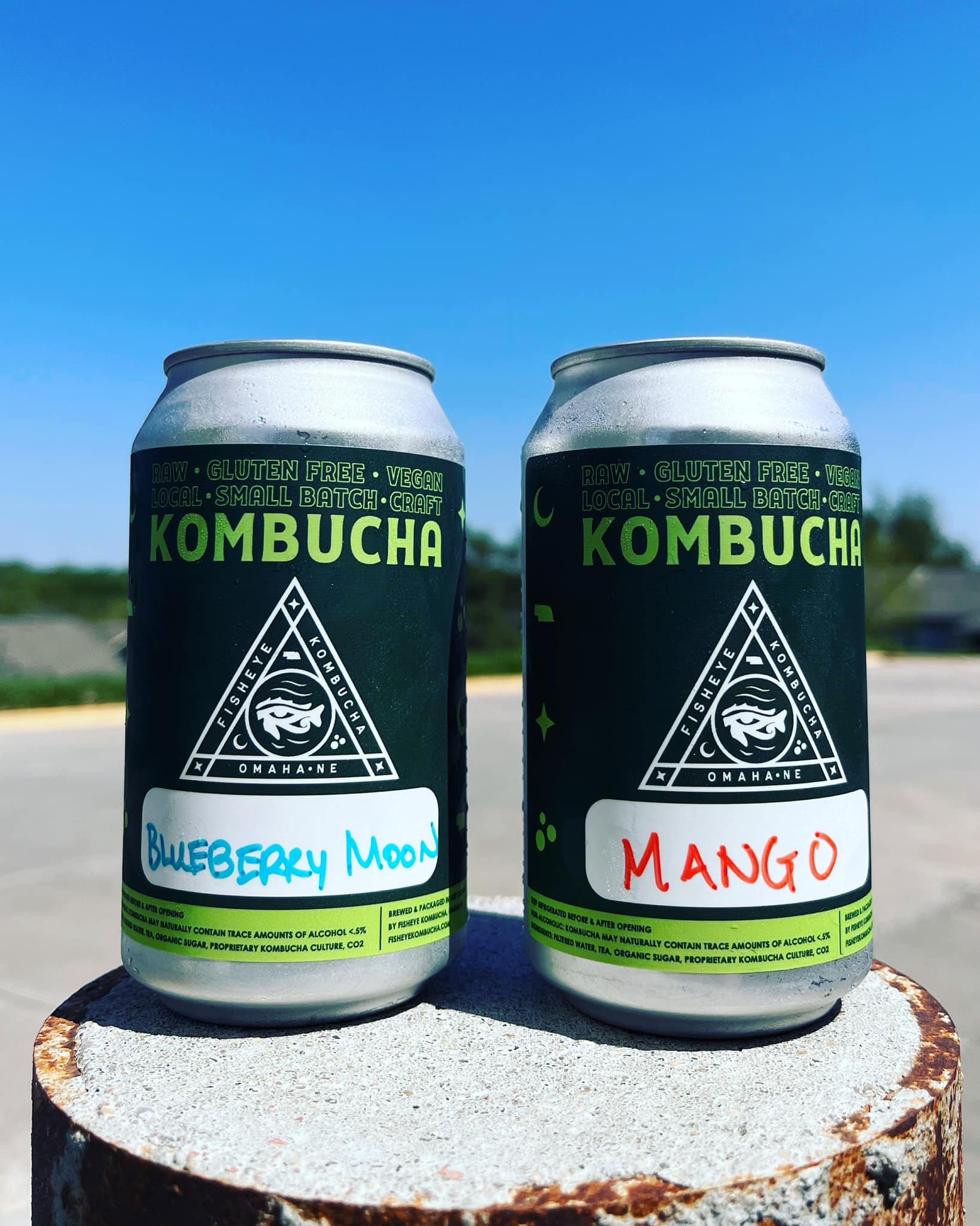
We developed a brand around the existing mark; the fisheye within a circle. A triangular mark serves as the new primary logo, encompassing the original mark and utilizing mystic and cosmic elements to create the visual language of the brand. Supporting branding includes tarot card-inspired icons, highlighting popular market flavors.

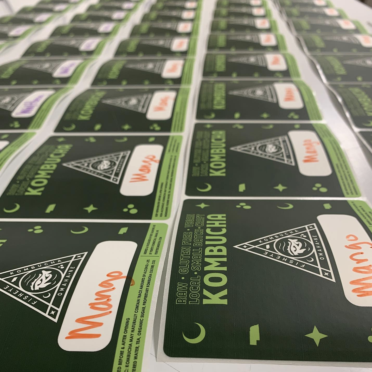
With the FishEye brand in place, we were next asked to develop packaging. FishEye Kombucha is currently offered in cans at a variety of retailers around town. We were tasked with designing a label for these cans; one that could have the flavor written in at a later date. The can label features familiar FishEye branding elements in a simple and convenient layout.

FishEye also employed us to create and manage a website that would allow customers to learn about the brand. We developed a simple, yet on-brand visual language to communicate the necessary messaging to visitors. Customers can learn find featured flavors, discover retail locations, place online orders, and even learn about the mysterious beverage known as kombucha.